Layout
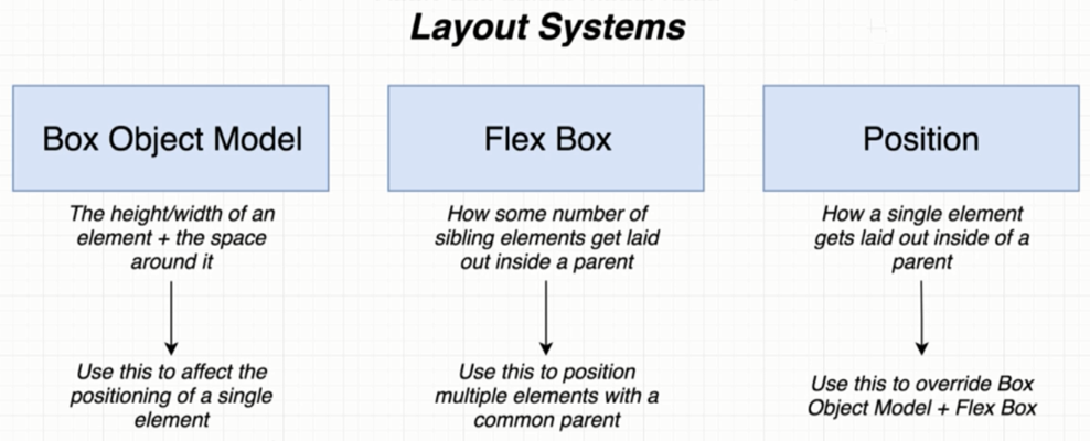
Layout有三種方式:
- Box Object Model
- Flex Box
- Position
Box Object Model

const BoxScreen = () => {
  return (
  <View style={styles.viewStyle}>
    <Text style={styles.textStyle}>Box Screen</Text>
  </View>
  };
}

const styles = StyleSheet.create({
  viewStyle: {
    borderWidth: 1,
    borderColor: 'black',
  },
  textStyle: {
    borderWidth: 1,
    margin: 20,
    borderColor: 'red',
  }
});
FlexBox
- Parent View has 3 properties that can affect how children are laid out
- flexDirection
- justifyContent
- alignItems
const BoxScreen = () => {
  return (
  <View style={styles.viewStyle}>
    <Text style={styles.textStyle}>child 1</Text>
    <Text style={styles.textStyle}>child 2</Text>
    <Text style={styles.textStyle}>child 3</Text>
  </View>
  };
}

const styles = StyleSheet.create({
  viewStyle: {
    borderWidth: 1,
    borderColor: 'black',
    alignItems: 'flex-end',
    flexDirection: 'column',
    justifyContent: 'space-between'
  },
  textStyle: {
    borderWidth: 1,
    margin: 20,
    borderColor: 'red'
  }
});
- Child View has 2 properties that can affect how children are laid out
- flex: a number to stretch the cell, the bigger number gets the most space
- alignSelf: flex-start, center, flex-end, stretch
const BoxScreen = () => {
  return (
  <View style={styles.viewStyle}>
    <Text style={styles.textStyle1}>child 1</Text>
    <Text style={styles.textStyle2}>child 2</Text>
    <Text style={styles.textStyle3}>child 3</Text>
  </View>
  };
}

const styles = StyleSheet.create({
  viewStyle: {
    borderWidth: 1,
    borderColor: 'black',
  },
  textStyle1: {
    borderWidth: 1,
    margin: 20,
    borderColor: 'red',
    flex:1,
  },
  textStyle2: {
    borderWidth: 1,
    margin: 20,
    borderColor: 'red',
    alignSelf:'center',
  },
  textStyle3: {
    borderWidth: 1,
    margin: 20,
    borderColor: 'red',
    flex:1,
  },
});
Position
- relative vs absolute
- top, bottom, left, right